
So since my last post, we have done a couple more briefs. All of which did not require any blogs. Finished our year on Friday. Figured I should write one more post just to wrap the year up. To put it briefly, I'm sad. It's been an awesome year getting to know everyone at MSVA and my CVA class is like family to me. We have been through a lot of dramas together and had a lot of good times. Ended the last day with a CVA party at Polo's, mean night... Everything had a sad tinge to it though. I spent our exhibition time walking round the school feeling really distant. Gonna miss it like crazy. A lot of great friends and memories were made there. I could stay, if even just for the place and the people, but my passion (film) would best be taught elsewhere. Maybe even Wellington ways..? I'm not entirely sure to be honest.. Going wherever it takes me. Still, I'm really sad about leaving MSVA.. Despite some of the stupid and crazy shiz I've done this year, I've learnt heaps and made some friends that are going to be with me for life.. A life that seems like a blur waiting to happen.
Peace xo.
That is all.
2
Jewelry and Me =does anyone else find that a cheesy brief title??
So today we started a new brief.. 'Jewelry and Me' and except for the cheesy name it looks like this could be an interesting brief. I've never done jewelry before, well apart from using my teeth to fix a broken link in a chain of one of my necklaces.. so am looking forward to seeing what we do over the next four weeks. Apparently we will be using actual silver and making rings and chains and other.. pieces? We had a powerpoint this morning that made me look a t jewelry in a whole new light. I didn't realize that we can decide what we want as jewelry. Anything shiny that decorates the body is jewelry, it doesn't even have to be shiny!! I really liked the flower necklace at the end. Reckon it would be coolys to make one with real flowers then make a metal one and paint it.. yeah.

peace
xo
K

peace
xo
K
 Posted by
Kayleigh ☮
Posted by
Kayleigh ☮
Completion..almost..
So I'm still making a background to attach my printed zine pages to, will add a picture of the final zine eventually.. anyways..
I found this brief challenging in the fact that it requires a high amount of concentration and hours in front of a computer. Trying to motivate myself to sit down in front of a screen and work was.. difficult? I have finally completed all of my zine pages though, including a large poster which combines all the other styles into one. I reckon my 'theme' is me and my thoughts or things I think about. The quotes/ sayings/poems are all ones I have heard or read and taken to heart. I love them because they describe or debate what goes on inside my mind. Thus why I titled my zine 'The Mind behind the Smile'. I used images of myself, not because I'm vain (damn straight) but because the writings apply to me in a personal way.. I'm not entirely happy with the final result because I think I rushed it a bit towards the end, but it turned out to be an interesting process. So here is my zine..


I found this brief challenging in the fact that it requires a high amount of concentration and hours in front of a computer. Trying to motivate myself to sit down in front of a screen and work was.. difficult? I have finally completed all of my zine pages though, including a large poster which combines all the other styles into one. I reckon my 'theme' is me and my thoughts or things I think about. The quotes/ sayings/poems are all ones I have heard or read and taken to heart. I love them because they describe or debate what goes on inside my mind. Thus why I titled my zine 'The Mind behind the Smile'. I used images of myself, not because I'm vain (damn straight) but because the writings apply to me in a personal way.. I'm not entirely happy with the final result because I think I rushed it a bit towards the end, but it turned out to be an interesting process. So here is my zine..
 |
| Back |
 |
| Front |


 |
| Poster |
I was pretty much playing around with different styles on each double page spread and then combined all of them as one in the final huge a2 sized poster.. Was planning to print it all on one a2 sized paper, but due to printing issues I've decided to get an a2 sheet of paper and artsy it up a bit then attach the printed pages to it..
peace
xo
K
Posted by
Kayleigh ☮
Week 3 ZINE update..
I have finally completed 4pages of my Zine (a mini magazine about a particular topic) which I've titled 'The Mind within the Smile'.. I came up with that title because my Zine is based around my thoughts, favorite quotes, poems, and all the other jazz that goes on in my crazy mind.. My first page was inspired by an image I came across on the net. It was an interesting process. My second page kinda came about from the first one..? I tried to invert the idea though..
This is my second two-page spread..
Figured I'm going to do one or two more spreads in different styles then combine all the styles in one large poster image on the back of my layout.. well thats the plan anyways.. I'm finding it difficult sitting in front of the computer all day but I guess it will be worth it in the end..
 |
| 1st page |
 |
| 2nd page |
 |
| 1st page |
 |
| 2nd page |
peace
xo
K
Posted by
Kayleigh ☮
The Recycled Glamour of Estelle Pemberton
We had a artist talk by and artist named Estelle Pemberton the other day.. She has an amazing range of skills in art that she has picked up over the years. I found it really interesting and inspiring listening to her. Mainly because she has this passion for art and so everything she does is to up-skill and feed that passion. For example, she wanted to be an artist technician so she studied welding and got a lowly job. She treats everything like experience so her skills range from a fine arts degree in sculpture, to welding and being a painting assistant to the artist Patrick Hughes. She also creates these one-of-a-kind handbags that she has made and sold throughout her art career.. She is a frequent seller at craft markets and has her own label called 'Recycled Glamour'. One of her main points was that you can never have enough experience, that you should always be growing and changing with your art and that you can't expect to jump right into a position. You have to start from the bottom and work at it until you get to the top. I found it good hearing that because I'm not entirely sure what I want to do.. But gaining experience wherever I can seems like a good idea.
peace
xo
K
peace
xo
K
Posted by
Kayleigh ☮
Three Illustrators/Designers..
Soooooo for this blog post we had to find three artists/illustrators/designers that use both text and image in their works and research them.. so here it goes..
Kristine Do
I came across Kristine Do ages ago when I was google imaging posters of one of my favorite bands, 'Raised by Swans'. One of the images led to her website and I found I really liked all her work. She is a graphic designer that uses a lot of typography and grunge effects. She enjoys working with the thriving underground music industry and thus designs a lot of band posters. She also designs patterns for extreme sports clothing. I really like the feel of her work and how she portrays the idea. Each one seems different and unique to the client..?


Montse Bernal
Montse Bernal is from Barcelona, Spain originally and has studied fine art and illustration. She uses a variety of materials, from dry media to painting, to even digital and some animations. Her works are beautiful and have a old french fashion sketch look to them. The colors she uses seem to emphasize the areas she wants us drawn to and the fonts/text give it a quirky look. I reckon the drawing skills by the artist are pretty amazing and very life-like.. am thinking I want to do some similar sketches in my zine.


Samuel Castano
Samuel Castano is a graphic designer and illustrator from the states. His works have a theme and a feel about them that bring up memories of past eras. He uses collaged newspapers a lot and snippets of what seems like other posters.. which creates feelings that communicate and mean something to someone. I like his work because he incorporates collage in a digital form..


Sweet so thats about it.. I have more in my visual diary because I'm a cool kid like that, but yeah.. farewell my lovers, farewell my friends (I have that song in my head..)
peace
xo
K
Posted by
Kayleigh ☮
An artist who works with pictures and words.. Barbara Kruger
 In reading the interview 'EGG' had with Barbara Kruger, I noticed a common thing in everything she was saying. Her idea of power through her work. The idea that pictures and words when placed together in such a way, can have power over the way we see and read things. Some might call it the power of advertising, but I think her work is a lot more in depth and meaningful than just showing us what we as the masses 'need'. But it is that very idea that seems to fascinate her. That she can in a way control our minds as viewers to look at her work a certain way. With her background in fashion magazines, she knows exactly how to accomplish this through her art. She is an amazing artist that is world-renowned for working with this 'power' that can control the minds of the masses.. that sounds kind of evil villain type stuff huh, but I'd never really realized this power before. The fact that my mind can be controlled by image and text without my realizing it.. I find it freaky really, but interesting too..
peace
xo
K
p.s. It's a conspiracy, man.
Posted by
Kayleigh ☮
Seraphine Pick..response?

peace
xo
k
Posted by
Kayleigh ☮
responding in randomness..
So after having three weeks off for semester break, we are right back into it and started a new brief yesterday called 'Manipulating the Image' which is based around Photoshop, Illustrator, and Indesign. Am looking forward to learning a bunch of new skills and making a 'Zine'. Anyways its only the second day and we already have this blog response due.. fun times fun times.. So here we go.
We had a powerpoint presented to us yesterday by our tutor, Frances. She showed us some artists that focus on text, logos, and imaging that conveys a message. There were some from way back in the days and a lot from more recent times. It was interesting to see how works from the past, created and still influence the works we see now. Our present day works still reflect or draw on the past..? I really liked the hand-painted, gold lettering which gave me some ideas for my 'Zine'. The Art noveau style looks like it would be an interesting concept to explore. The fact that an entire style, if not era, was defined by one font got us talking and thinking about fonts that define or dominate our present day world. I never realized how much text and image can draw in our attention and get us thinking..
The works of Jenny Holzer seem to do just that.. She is well-known for using large neon letters or huge light projections to write out a message, usual on a very large and public building, that relates to people and draws their minds in. I also really liked Sabrina Ward Harrison's work. She uses cute, scribbly texts/fonts and ink runs on ripped paper to create a really unique look. It draws on the Indie and Grunge styles with a bit of scrapbooking chucked in..


Cara Ober was another artist who I liked as well.. I found the powerpoint really interesting and inspiring. Am looking forward to this brief!!
peace
xo
K
 |
| Hand-painted, gold lettering. |
 |
| 'PROTECT ME FROM WHAT I WANT' |
 |
| 'MY ARROGANCE' |
The works of Jenny Holzer seem to do just that.. She is well-known for using large neon letters or huge light projections to write out a message, usual on a very large and public building, that relates to people and draws their minds in. I also really liked Sabrina Ward Harrison's work. She uses cute, scribbly texts/fonts and ink runs on ripped paper to create a really unique look. It draws on the Indie and Grunge styles with a bit of scrapbooking chucked in..


Cara Ober was another artist who I liked as well.. I found the powerpoint really interesting and inspiring. Am looking forward to this brief!!
peace
xo
K
Posted by
Kayleigh ☮
break time....FOR THREE WHOLE WEEKS!!!
Wow!! Three whole weeks off!!! Talk about an intense last week though. Had so much to catch up on (was not behind because I was lazy btw.. just life mashed together made it.. hard?)!! Don't think I went to sleep before 3am at all last week.. Was helping fellow class citizens out, but I reckon we all did aite on our presentations.. well kind of. I was the last one presenting. SORRY if I went on too long CVA lolz got a bit carried away and am very passionate about the artists I researched.. Yay that Louisezzy isn't leaving too!!!!! So yeah much love to MSVA! Thats to PA, DVA, and CVA!! Love that you all know each other now.. especially since I introduced yous all lolz well most of the time anyways. Looking forward to Tuesday in Manx with you all..
laters blogspot, see you in a month!!!
peace
xo
K
laters blogspot, see you in a month!!!
peace
xo
K
Posted by
Kayleigh ☮
postmodernism....ism..
So yesterday we had a guest lecturer, Mark Hanlen, come and speak to us about several things. He spoke about the two types of space, talked us through an in-depth powerpoint focusing on modernism, and briefly touched on postmodernism. I personally find postmodernism architecture rather interesting so I figured I'd focus on that teeny part of the lecture..
< Modernist
Architecture
Postmodernist >
Architecture
Postmodernism architecture as a movement came into being in the late 1950's. It is described as the return of "wit, ornament and reference" to architecture and emphasizes that the masses are not to be unified, but accustomed to. I reckon postmodernism is neutral. Its neither just modern, nor just old. It's both. When modernism kind of, well, failed.. a group of people took the new modernist idea of 'form following function' and combined it with the old ways of designing for appearance. With postmodernism, its as though architects rediscovered the symbolic value and the form of architecture as it has changed through history which had been ditched by the ideas that make up modernism. It combines the functionality of modernist architecture, which is machine-like in that it is built for efficiency and function, with the more creative and decorative approach of traditional architecture. Mark stated that post modernism was "..incredulity toward meta-narratives" which pretty much means disbelief in the abstract idea that there is a comprehensive kind of a story or narrative that is deeply embedded in a particular culture and justifies its power structures. Or more basically put, a disbelief in a unified idea to solve all mankind's problems such as modernisms belief that by creating buildings that focused on efficiency and function, life would be perfect. This idea kind of touches on Marx's theory of Utopia... Which kind of makes sense, but by ignoring the face of building and the beauty in its appearance, we lose the feelings architecture can stir up within because when you think about it, architecture is sculpture too.. it fills a space and that space has a meaning. We as humans, feel. Building purely for need without touching on that idea of feeling, makes buildings boring. Postmodernism challenged this perception and in a way, brought the romance back into architecture. So postmodernism architecture is pretty much efficiently modern, but at the same time, it has feeling. Its not just functional, but beautiful.
 |
| Seagram Building, NY |
 |
| Harold Washington Library, IL |
< Modernist
Architecture
Postmodernist >
Architecture
Postmodernism architecture as a movement came into being in the late 1950's. It is described as the return of "wit, ornament and reference" to architecture and emphasizes that the masses are not to be unified, but accustomed to. I reckon postmodernism is neutral. Its neither just modern, nor just old. It's both. When modernism kind of, well, failed.. a group of people took the new modernist idea of 'form following function' and combined it with the old ways of designing for appearance. With postmodernism, its as though architects rediscovered the symbolic value and the form of architecture as it has changed through history which had been ditched by the ideas that make up modernism. It combines the functionality of modernist architecture, which is machine-like in that it is built for efficiency and function, with the more creative and decorative approach of traditional architecture. Mark stated that post modernism was "..incredulity toward meta-narratives" which pretty much means disbelief in the abstract idea that there is a comprehensive kind of a story or narrative that is deeply embedded in a particular culture and justifies its power structures. Or more basically put, a disbelief in a unified idea to solve all mankind's problems such as modernisms belief that by creating buildings that focused on efficiency and function, life would be perfect. This idea kind of touches on Marx's theory of Utopia... Which kind of makes sense, but by ignoring the face of building and the beauty in its appearance, we lose the feelings architecture can stir up within because when you think about it, architecture is sculpture too.. it fills a space and that space has a meaning. We as humans, feel. Building purely for need without touching on that idea of feeling, makes buildings boring. Postmodernism challenged this perception and in a way, brought the romance back into architecture. So postmodernism architecture is pretty much efficiently modern, but at the same time, it has feeling. Its not just functional, but beautiful.
Posted by
Kayleigh ☮
CVA’s arvo at the Museum...
Soooooo Friday was AWESOME!! We 'borrowed' one of the school vans and went on a cruise around town. First we visited the Marae at Auckland Uni and after mucking around in the elevators (...) we checked out some of the architecture (currently working on a brief about sculpture and architecture). We then headed to Penrose? Not entirely sure as we were yelling things out the windows at people on K'rd so got distracted and didn't pay attention.. But we stopped for a feed at some international food place..expensive much. Well when you compare it to Otara.. After all that we headed to the Museum. I'm sure they didn't know what hit them when we all turned up. We started out all together and ended up all over the place. Good times..good times. Here are some pics, a warning though, I like taking pictures on an angle..:


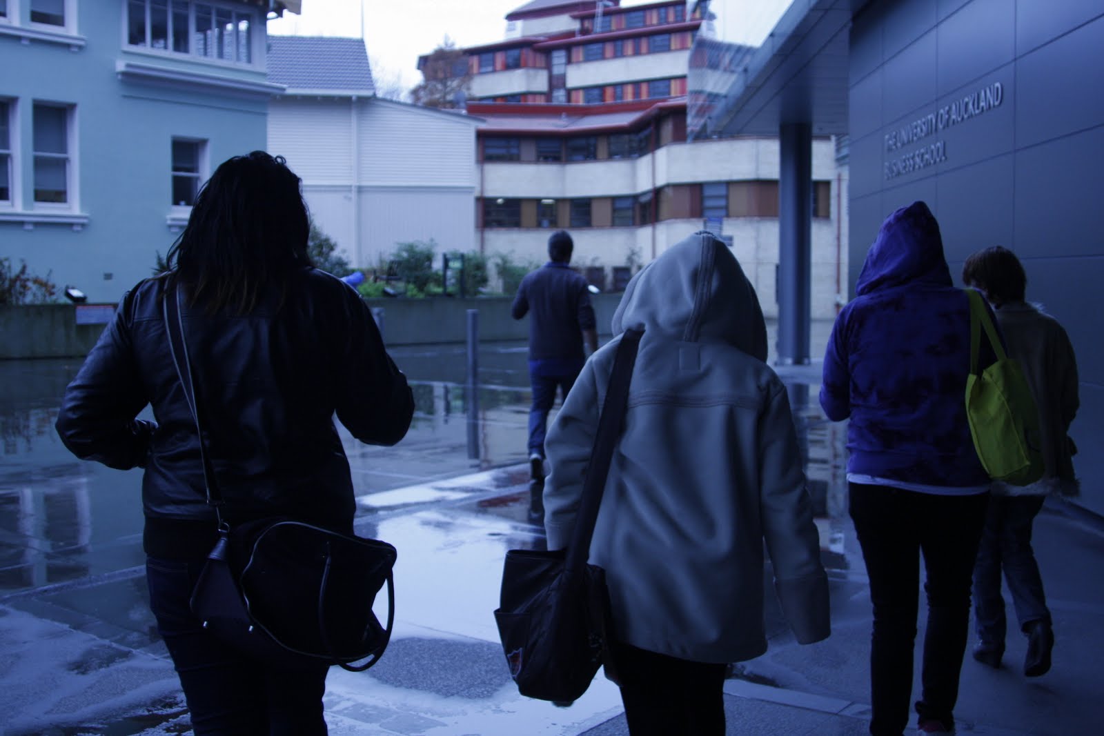
Nat, Kerryn, Louise, and Rochinda..and Nathan up ahead..

CVA whaaaaaaaaaaaaaat!!

Kerryn teletubies moment..

What a rainy day..

pssssssssssssssssh I like this picture.. reminds me of lego bricks.

These pillars made me feel intensely small.

I like the angles in the main entrance ae and the statue above the door.

love this pic.. all the angles work well I reckon.

The ceiling.

Flags.. I loik the composition..

Yet another shot of the foyer
So yeah, went a bit nuts with the pictures, but oh well..
peace
xo
K
Posted by
Kayleigh ☮
Musée du Louvre and its pyramid..

The Musée du Louvre is an amazing example of architectural metamorphoses as it was created in several phases. It was first built in the late 12th century as a fortress to protect the city of Paris which was Europe's largest city at the time. It has since been a palace to numerous royals and several extensions have been made to it by different architects. At the end of the 18th century, part of it became a museum that displayed some of the most famous paintings in the world which over the years to follow, gradually took over the entire premises. Making the Louvre one of the largest, historic museums in the world. The most recent addition to the Louvre was the construction of the glass pyramid, which is now the main entrance. The pyramid was built in 1989 by an American architect named I.M. Pei and lets the sunlight to come in on the underground floor. It is an amazing structure made of glass and metal, surrounded by three smaller pyramids, and reaching almost 25meters into the sky. I love how it reflects and lets the light in during the day and seems to sparkle at night. It was created because of a series of problems with the Louvre's original main entrance, which couldn't handle the many visitors that came to the museum everyday. Visitors now enter through the pyramid and go down into the huge glass lobby then head up into the main Louvre buildings. The fact that it serves a function, but also is in itself a sculpture, is what I like about the pyramid. It has an almost postmodernist feel to it that appeals to the senses. We look at it and question it. Question as to whether it should be there or not considering its surroundings. This amazing piece of architecture caused many haters when it was first built because it sharply contrasts with the classical buildings surrounding it. It is now generally accepted as a modern update and new phase of the Louvre, a building which has had many facelifts in its time.
Posted by
Kayleigh ☮
tall tree and the eye....

Anish Kapoor's sculpture, 'Tall Tree and the Eye', is a steel structure made up of 76 shiny spheres arranged to tower 15meters high alongside the surrounding buildings. It was made in early 2009 and then exhibited in the courtyard of The Royal Academy from September to December of the same year. The steel structure which combines randomness with a feeling of weightlessness, is inspired by the words of the German poet Rainer Maria Rilke. "It is a conjunction of images I have always loved in his Sonnets to Orpheus and this work is, in a way, a kind of eye which is reflecting images endlessly," said Kapoor. It is a tree-like arrangement of reflective, light bubbles that seem to reach up to the sky and convey the nature of how things appear. It shows us how through manipulating light and shade, volume and space, the time and place can be suspended and altered. I love how it is such a modern looking sculpture, yet it blends in with the historic buildings surrounding it which almost seems contradicting in a way..They are different, but related. I don't know much about what was going on at the time it was made, but Anish Kapoor was given full exhibition space at The Royal Academy which is considered one of the most prestigious art gallery's in London. Several people think his works displayed there were a mockery to the history of the art gallery, but many more are amazed by his ability to force the new and old together.. In some ways the gallery needed a fresh, modern display of defiance that would bring it to the present. I reckon that was the idea or context surrounding this particular exhibition of Anish Kapoor's and he achieved exactly that with this buzzy sculpture.
 Posted by
Kayleigh ☮
Posted by
Kayleigh ☮
construction in space..a new brief..dum dum DUM
So today was the first day of our new brief, 'Construction in Space', which is focused mainly on sculpture. Looks like its going to be completely different from the last one we did, waaaaaaaaaay more contextual studies than practical studio stuff. Yay. (sarcasm). It was fun today though. We split into groups and took photos around the centre of what we deem as sculpture then we built 'shelters' out of cardboard boxes being the homeless people that we are. My team, the B team, won. Of course. Nah, we CVA are all one love!! But here are some bad quality pictures..


The B team's structure..


The house that fishy and me built..just coz were cool kids..

Kerryn Quirky chillin' in our hut..

It even says 'Home Sweet CVA Home' AND it has a chimney!!

It even says 'Home Sweet CVA Home' AND it has a chimney!!

My fav picture from today.. twins? nah.
So yeah..guess thats an update.
peace
xo
K
Posted by
Kayleigh ☮


Subscribe to:
Posts (Atom)


